One huge problem video marketers constantly face is:
The difficulty involved in engaging a large audience with your important information and statistics.
But why is that the case?
Because most people are going about it the wrong way! They are trying to present their facts and figures in a format that’s not designed to perform those functions. The result is almost always boring and unengaging.
So, what is the right format?
Well, that’s exactly what I’m going to discuss in this post:
The Spiel guide to animated infographics with 25 of the world’s best examples!
What is an Animated Infographic?
An animated infographic is a visually appealing depiction of data, facts, figures, and stats. They can cover any subject and, thanks to their ability to transform often boring figures into vivid, memorable experiences, are easily absorbable and informative for specialists and casual viewers alike.
But, as the digital landscape becomes more and more cluttered with content, basic image infographics, though effective on their own, just aren’t cutting it like they used to.
That’s where animation comes in!
By enhancing your image with motion, it will naturally draw the attention of the human eye. So, for maximum engagement, you should get the audience interested with attractive animation and then keep them interested with surprising and informative content.
“By enhancing your image with motion, it will naturally draw the attention of the human eye.”
The 10 most common styles of animated infographic are:
- Maps: For data intrinsically linked to a geographical location (or locations), using maps to visualise it is the most effective method.
- Process or How-To: Directional cues take the viewer through a series of instructional steps.
- Exploded View: Each component of a product is separated in the order of assembly to get to the core of how it works.
- Comparisons: Two or more similar, or dissimilar, things are compared side by side to highlight their distinctions.
- Interactive: The viewer can interact with the animated infographic by clicking on various components for a closer look or to influence the content in some way. Take a look at my interactive video guide for more info here.
- Data Visualisation: In-depth information can be easily communicated with Venn diagrams, pie and bar charts, line graphs, etc.
- Kinetic Typography: For infographic videos especially, animated moving text is a great way to convey more abstract information.
- Timeline: A chronological visualisation of how something has changed or evolved over a certain time period.
- Hierarchy: Various components making up a single subject are arranged in order of importance, usually using a hierarchy pyramid.
- Informational or List: Text-heavy rather than number-heavy. Ordered lists like ‘top-10s’ are a sure way to hold people’s attention.
Animated infographics can be made for multiple reasons, such as product or service explanations, education, recruitment, corporate videos or even just for pure entertainment.
If you would like to get a better idea of which style would work best for you, they are all covered in the 25 examples at the end of this article.
How Can I Create an Attention-Grabbing Animated Infographic?
Creating a great animated infographic is all about knowing how to find the perfect animation company for you, then building a constructive collaboration with them.
Here are my top 8 guidelines for doing just that:
- Goals: Before approaching agencies, set goals for your infographic that can be measured: ‘Increase my social media following’ as opposed to ‘explain my company history.’This will have a positive domino effect on the rest of the campaign. It gives a good agency direction for research, which in turn informs the key performance indicators, the budget, the content, the art style, and so on.
- Location: If you prefer to meet the animation company in-person, only search for ones in your area. For example, search ‘infographic animation company London’ or ‘best animated infographic agency in London’.
- Study Portfolios: Examining agencies’ portfolios and client reviews will allow you to:
- See if their style and quality work for you
- See if they have worked well with similar or well-renowned businesses
- Save some of your favourites to reference when talking to them
- Brief: Take some time to summarise the key information that you want to be included in the infographic as well as your brand ethos. This will help an agency when they are formulating a creative treatment for the project.
- A True Collaboration: If an animation company is offering you a definite quote after just one phone call, know they’re looking for a quick sale rather than a collaboration focused on producing a successful animated infographic.
- Know the Creatives: Firstly, you will talk to a salesperson, who will take your information on-board and help you get a better understanding of the process.As the project progresses, however, also make sure you’re in communication with the creative director. They are the ones who will be able to translate your brief into the most compelling, eye-catching animated infographic possible.
- Trust Your Feeling: After corresponding with an agency a few times, ask yourself how those interactions have been.
- Do they seem passionate about your project?
- Are they responsive and helpful?
- Do they seem to be grasping your message?
- Be Open: As long as you’re open to professional opinion and are realistic with your budget and schedule, you’ve everything you need to form an amazingly productive and long-lasting collaboration.
Now, here are 25 of the world’s best animated infographics online:
How Far Can North Korean Missiles Go?
This attention-grabbing animated video infographic was created by YouTube channel The Infographics Show. It plays on recent news headlines by informing the viewer exactly where on the globe the reported North Korean intercontinental ballistic missiles could potentially reach.
The colourful 2-D animation clearly conveys the voiceover and flows naturally from point to point. As their name suggests, The Infographic Show is a channel dedicated purely to animated infographics, and, with 3.5 million subscribers, they really do demonstrate how compelling the style can be.
How to Build a Human – Animated Infographic
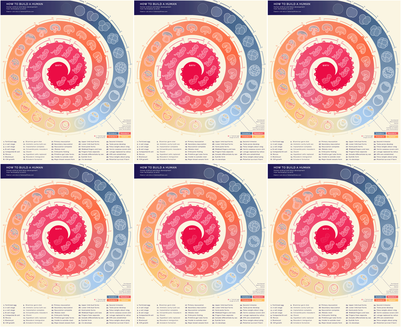
This animated infographic GIF was created by digital entertainment company Nerdist. It is an easy to understand visual guide to all 40 weeks of pregnancy from fertilization through to birth.
Animated infographics are a great tool because they can fit so much valuable information into such a small space, and do it in such a way that doesn’t feel cluttered or confusing. Animating your infographic image will naturally draw the attention of casual browsers.
With or Without EU – Animated Infographic
Infographics can be used to explain some of the most complex topics in a succinct manner. The School of Business, Management and Economics at the University of Sussex proves it with this 3-minute clip about post-Brexit Britain.
The clean, sleek animation uses block colours and smooth transitions to effectively distinguish between Britain’s various imports and exports as well as where they come and go around the world.
Evolution of Insight – Animated Infographic
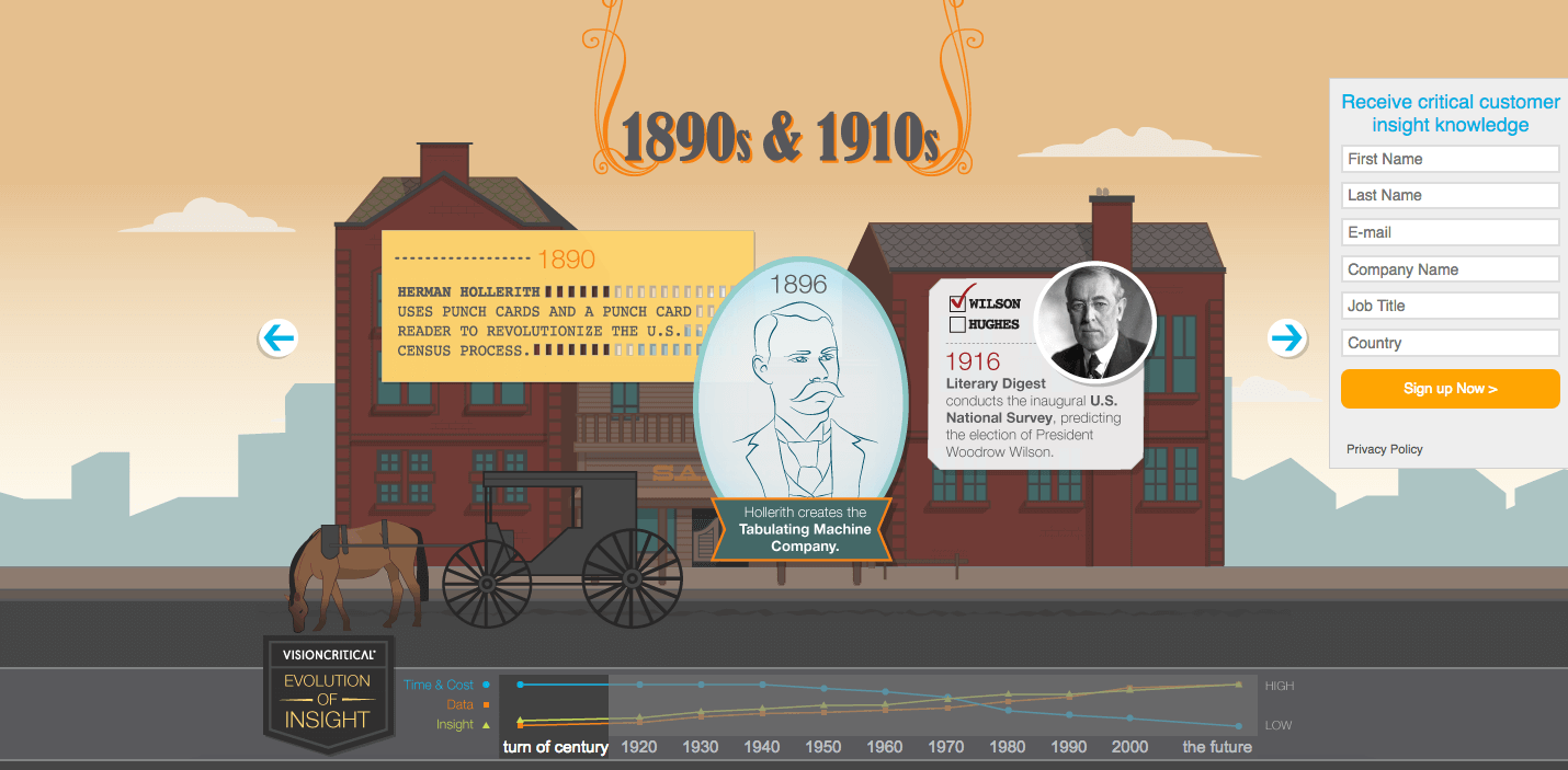
This interactive animated infographic was made by cloud-based customer intelligence platform Vision Critical. It is a visual history of the evolution of insight beginning in the 1890s with Herman Hollerith revolutionizing the census process and ending with ‘in-the-moment’ mobile data collection.
The animators did a great job at representing the aesthetic changes throughout the previous century. And allowing the audience to interact with the infographic adds a whole new level of engagement. If they can choose where to focus their attention, they are likely to stay with it for longer.
Cheetah: Nature’s Speed Machine – Animated Infographic

Educational content maker Animagraffs created this animated infographic all about the world’s fastest land mammal. Using beautiful sketch-style animation, it gives the viewer the essential facts about cheetahs while making interesting comparisons, like to the speed of a Ferrari Enzo.
Infographics are a great way to educate people because they weed out the unimportant information and present what matters in a visually appealing way, helping people retain what they’re learning.
The Seas of Plastic – Animated Infographic
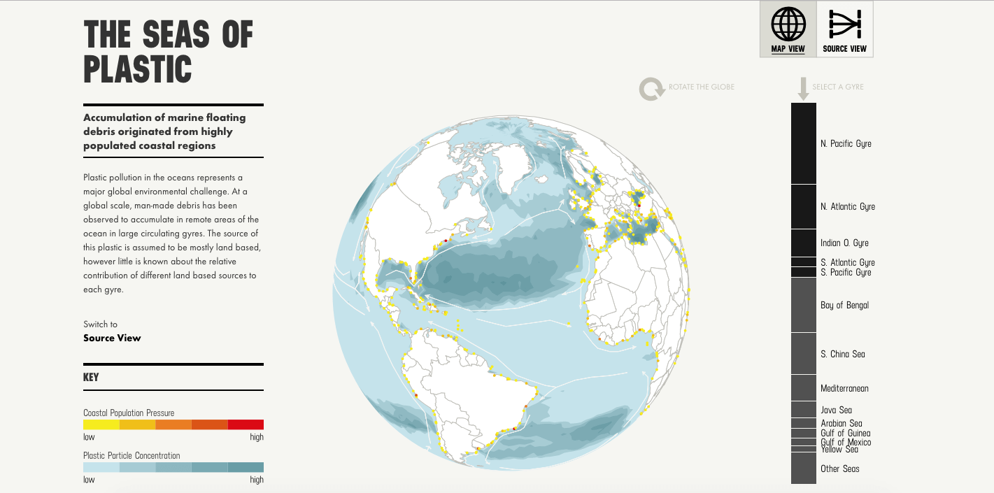
This detailed interactive infographic, titled The Seas of Plastic, allows the viewer to control an animated 3-D graphic of the earth, depicting 30 years of accumulated floating debris in the world’s ocean.
Infographics are a fantastic tool for modelling and tracking complex systems and data inputs, even on a world scale. When trying to portray something of such enormity, it’s a helpful and powerful way of getting vital messages across.
Chronology of the Universe – Animated Infographic
This 3.5-minute animated infographic video takes on the very ambitious task of summarising the 13.7 billion-year history of the universe, and all without voiceover. Instead, it combines dramatic music with ethereal graphics and concise text to represent all of the major development stages.
Don’t be afraid to be ambitious with your animated infographic. And, if the topic allows, utilise sound design to engross the viewer in the world, or universe, you’re revealing.
42 Butterflies of North America Animated Infographic

Science blog Tabletop Whale created this animated infographic as a guide to 42 of the most unique species of butterfly in North America. It is more visual than it is informative, but it still includes their common names, scientific names, sizes and locations.
This is one of the most referenced animated infographics I have come across online. The reason for its popularity is its moving animation and the quality of that animation. Having life-like, fluttering sketches of butterflies instantly catches the attention of anyone with the even remotest interest.
Global Air Traffic – Animated Infographic
This fascinating animated video infographic was made by German creative communication solutions agency Rightcolours. It visualises interesting facts and trends about worldwide air travel, such as the biggest cause of delays, and ranking the world’s busiest airports.
The simple animation continuously pans on to the next fact or point making it simple to follow. A great technique if you want to create an animated infographic packed full of curiosities.
The History of Europe: Every Year
This well-researched historical infographic maps European boarders and populations every year from 400 BC up to 2017. Given just 12 minutes, I cannot think of a more effective way of visualising Europe’s population dynamics throughout the centuries than with this style of animated infographic video.
With over 5 million views, this clip is more proof that the to-the-point appeal of infographics works. The more effort you put in, the more likely you are to be rewarded.
The New New York Skyline – Animated Infographic
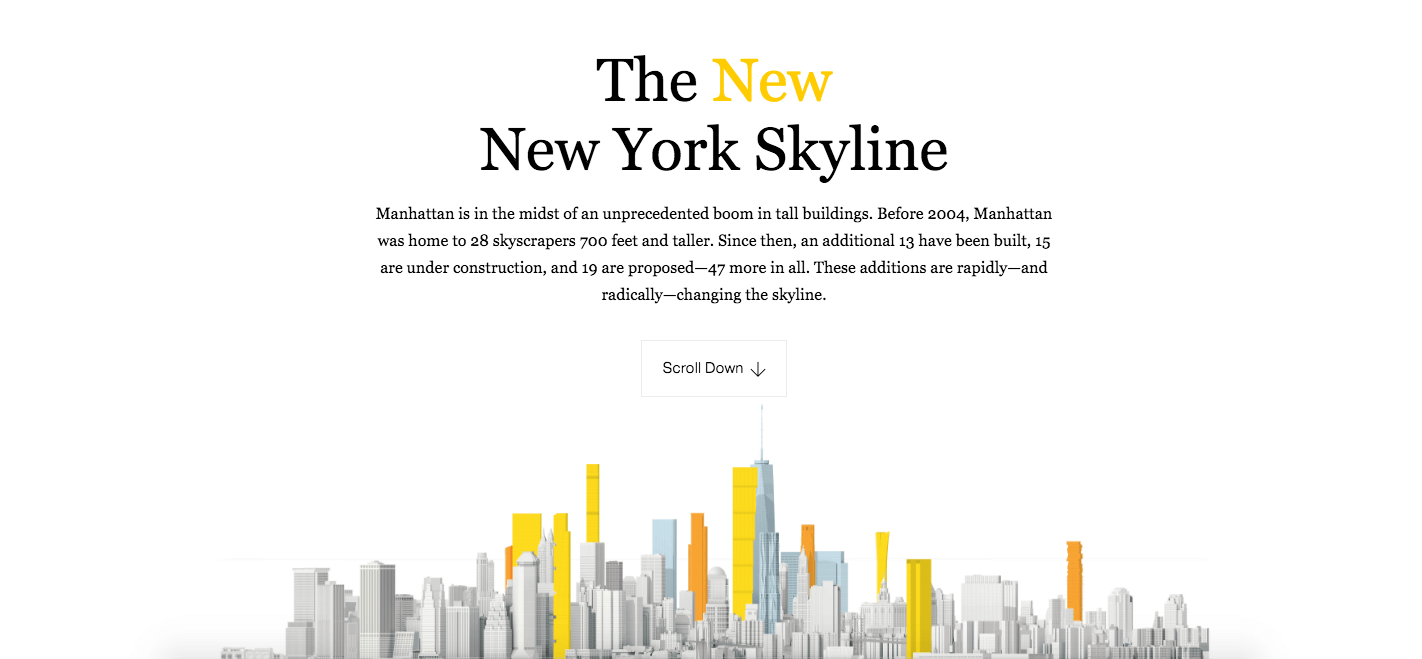
Iconic magazine National Geographic created this interactive animated infographic to show how the New York skyline will change radically by 2023. With 47 new skyscrapers either built, under construction or planned between 2004 and that year, the city is undergoing an unprecedented transformation.
Interactive infographics are not only an excellent way of envisaging future plans, they also allow people to focus on the bits that interest them.
Hellmann’s – It’s Time for Real – Animated Infographic
Food product brand Hellman’s created this in animated infographic for a Canadian audience. It promotes buying food that has been produced within the country by informing customers of their growing reliance on imports as well as their declining exports.
What makes this infographic stand out is its creative combination of 3-D animation and stop-motion. Having the food portray each fact cleverly reinforces what’s being said.
Think about how you could combine animation styles to attract attention to your infographic.
Landing Page Best Practices – Animated Infographic

Email design and HTML coding company Email Monks created this innovative animated infographic all about optimising your landing page. By scrolling down the screen, you are in control of a car driving down ‘Landing Page Road’, leading straight to ‘Business Success’.
Think about clever ways you can take the viewer on a journey with your animated infographic. Make them excited to stick around and find out what’s going to come up next.
Vitamin Atlas: An Interactive Guide to Nutrition and the Human Body
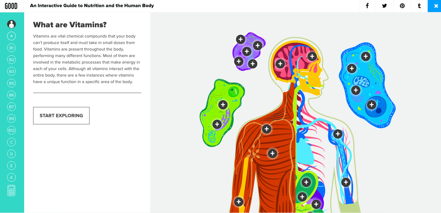
Global news company GOOD created this in-depth interactive infographic as a guide to vitamins and the various function they perform in the human body. It provides information about every vitamin, like background on how and where it was discovered, what it does in the body and in what foods it can be found in.
If your business is highly complex, use animated interactive infographics to help potential customers better understand your product or service.
Social Networks – In Numbers
This is a good example of a low-budget animated infographic made by a student. It breaks down the worldwide users of Facebook, Twitter and YouTube by numbers and in doing so makes some fascinating points.
What sparks my interest in this video is the comparisons it makes. For example, if Facebook, with its 955 million users, were a country, it would be the third largest in the world behind India.
If your viewers are anything like me, including curious comparisons that convey things like scale in your infographics will do a lot to hold their attention.
“If your viewers are anything like me, including curious comparisons that convey things like scale in your infographics will do a lot to hold their attention.”
Adobe Illustrator vs Adobe Photoshop – Animated Infographic
This animated infographic is an interesting example of how the format can be used to compare two similar things and highlight their differences. Here we see Adobe’s vector graphics editor Illustrator side by side with Adobe’s raster graphics editor Photoshop.
Perhaps a critique you often hear about one of your products is that it’s the very same as another, but you know that this is a misunderstanding. Animated infographics could be the perfect tool to dispel all confusion.
Economic Inequality is Fixable – Animated Infographic
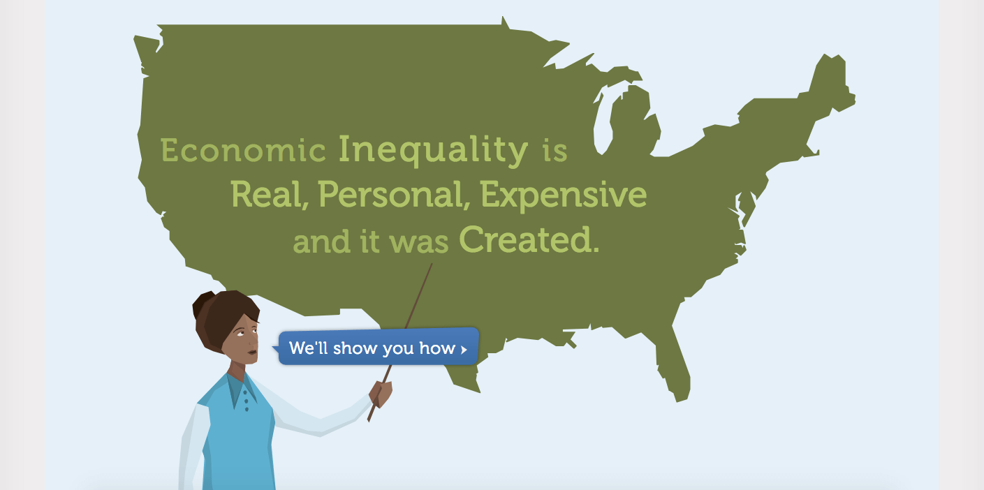
American non-profit think-thank The Economic Policy Institute created this animated interactive infographic to educate people about how economic inequality was created and how it can therefore be fixed. It offers visitors a chance to learn the facts around factors like trade, tax fairness and labour standards as well as myths like the American dream and trickle-down economics.
Infographics are a powerful tool for simplifying issues that people might otherwise be turned off of. Encouraging them to get involved and take action.
Save the Elephants – Animated Infographic
Environmental organisation WildAid created this 3.5-minute animated infographic as an urgent wake-up call to the plight of the world’s elephant populations. It instantly grabs the viewer’s attention with the shocking fact that of the original 350 elephant species, only 2 remain.
This is a great example of an infographic video using kinetic topography (or ‘moving text’) to communicate its agenda. This inexpensive form of animation is effective at reinforcing key messages.
An Analysis of The Beatles – Animated Infographic
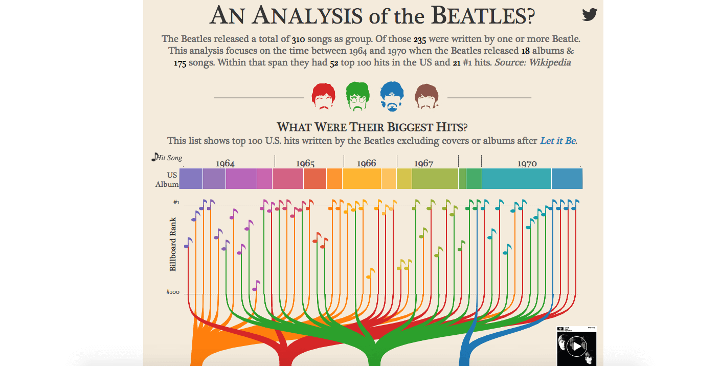
This brilliant interactive infographic image was created by analytics and art blog Dueling Data. It breaks down the Beatles discography by band member for the 7 years they were releasing music as a group.
It provides music nerds with data like: who wrote most of their songs, what most of their songs are about and which of them had the largest vocabulary (not Ringo).
Never underestimate the attention purely interest-based infographics can attract to your cause.
7 Ways to Hack a Drought – Animated Infographic

Data visualization company Column Five Media created this animated GIF infographic to help Californians cope with the water restrictions the drought-prone state has implemented. It visualises 7 easy ways of reducing water consumption.
Why not add some simple motion to your still infographic? The engagement benefits of doing so are well worth the minimal effort required to do it.
#NoFoodWasted – Animated Infographic
NBCUniversal’s sustainability initiative Green is Universal created this shocking animated video infographic for Earth Week 2015. It highlights the problem of food waste in America, and opening with the unbelievable stat that 40% of all food in America is thrown away certainly got my attention.
I like this video because it encourages people to be more environmentally conscious by showing just how much it would benefit them personally, rather than expecting everyone to see the bigger picture.
Also, to boost awareness, think about putting your brand colour centre stage in your infographic.
2013 on Ustream – Animated Infographic

Live video streaming and video hosting company Ustream, now IBM Cloud Video, decided to create this entire animated infographic website for maximum exposure. The animation moves in relation to the scrollbar. As you move down each page, the animations pop out to supplement stats.
Depending on the nature of your business, presenting your vital statistics up front and centre in a bright and bold fashion could be a perfect tactic for boosting your conversions.
“Depending on the nature of your business, presenting your vital statistics up front and centre in a bright and bold fashion could be a perfect tactic for boosting your conversions.”
How Speakers Make Sound – Animated Infographic
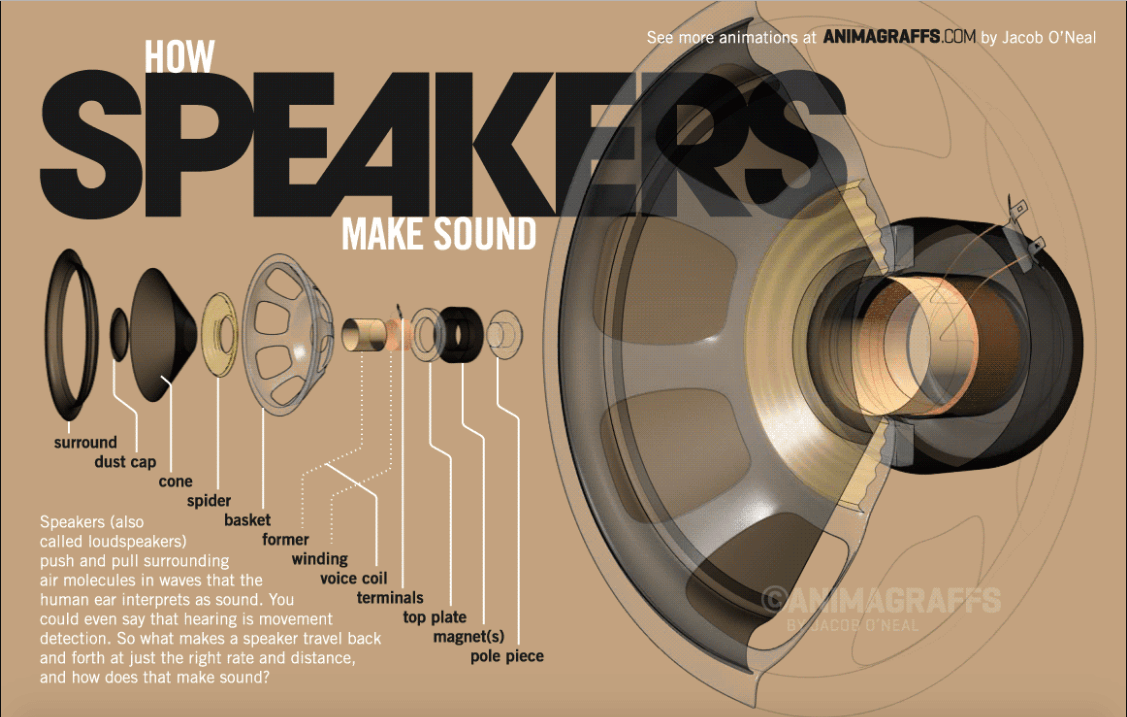
This detailed, professional animated infographic turns realistic exploded view sketches into GIF images in order to explain how speakers work. It provides technical details about magnets, cones, suspension and sound waves.
This style of animated infographic is perfect for explaining highly complicated and technical products. If you are targeting professionals or people who are knowledgeable about your industry, a great product board will let them know exactly why they should choose to buy from you.
Omega Pharma – Animated Infographic
Belgian-based pharmaceutical company Omega Pharma created this animated video infographic to build awareness of their growing importance in the industry.
This is a great example of a multifunctional corporate marketing infographic. It could just as easy be classed as a brand advert or even an explainer video. Sometimes infographics are the most effective way of getting your brand messages across.
Free Business Directory
Children of the Recession – Animated Infographic
Non-profit organisation UNICEF created this poignant animated video infographic to highlights the impact the economic crisis is having on child well-being in rich countries. It uses kinetic topography, emotive music and graphs to present a worrying trend in European child poverty.
One thing I especially like about this video is its character design. It shows the range of children effected and sends a powerful message by keeping their faces featureless.
Conclusion
- I hope this post has given you a better understanding of animated infographics and maybe even got you thinking about making your own.
- While watching these 25 examples, are there any that relate to your infographic needs?
- Please leave any questions or feedback in the comments below. I’d be happy to get back to you!
If you would like to learn about explainer videos, one of the most engaging video styles, you can check out my definitive guide to the subject here.


Thank you so much for sharing this useful information.
I Really like your blog! Ideal important information that has been truly helpful. I hope you and your loved ones have a very good day!
Thank you Arena
Thanks Greg
I learn from this article, very helpful for us, visitors you can also learn more.
Great info. what software is used to create these animated infographics?
Thanks for the article, very inspiring. Just to note, the second example is mis-attributed as being produced by nerdist. It is actually produced by Eleanor Lutz of tabletop whale (who is correctly attributed in a later example)
nice blog, but you left out the platforms used to create those videos. It would be nice to know what they were.
Really nice to read such a helpful blog. You have mentioned important points in a easy way to understand.
Thank you Aleena
This article definitely gives us more understanding of animated infographics. Thank you for sharing the examples as well for better understanding.
Thanks Travis
This post has given a more comprehensive view of the animation world with different infographic examples. Understanding and choosing the best examples mentioned above can help to make a killer video. I just love this blog! Thanks for sharing.
Thanks Chehak. Glad you enjoyed the post!
Very nice post. I just stumbled upon your blog and wished to
say that I have truly enjoyed your articles.
In any case, I will be subscribing to your blog and I hope you write again soon!