Why should you be interested in explainer videos?
Well, imagine if I told you that, if you added a good explainer video to your website or social media pages, it would instantly engage people with your company, product, or service and increase your conversions. And all without breaking the bank!
Would you believe me?
No?
Well, you’ve come this far, so you may as well stay for a bit and give my definitive guide to explainer videos a look and find out for yourself!
What are Explainer Videos?
Explainer videos are short online marketing videos that, with the help of a narrator, succinctly explain anything relating to your product or service.
How Can I Benefit from an Explainer Video?
Explainer videos are an engaging way of communicating to your audience in a personal way. And, believe it or not, according to Animaker, 88% of online businesses already own one! So you’re reducing your potential impact if you happen to one of those that still doesn’t.
Here’s an animated video we put together for Verto Group Developments:
The benefits of creating an explainer video include:
- They are brief and target a specific audience for a specific purpose – being direct is crucial for audience engagement
- Videos are shared on social media more than any other content. Being easy to link to means people don’t have to go out of their way to put them on a website or platforms such as YouTube and LinkedIn
- Having a video on your website landing page can, according to one study by Eyeview Digital, increase conversion rates by as much as 80%
“Having a video on your website landing page can, according to a study done by Eyeview Digital, increase conversion rates by as much as 80%.”
You will find that many explainer videos are animated. This is because animation comes with some additional benefits above live-action productions. They include:
- The simple, narrative-driven animation in explainer videos can clarify even the most complex topics while still holding your viewers’ attention
- With animation, you have unlimited scope to get as creative and as crazy as you want. Whereas with live-action, you’re confined to whatever your actors can do
- Funny or adorable animation can really humanise your brand and build up trust with the viewer
- It’s more affordable than creating live-action videos with actors
Explainer Video Case Studies
CrazyEgg
Nowadays CrazyEgg is a hugely popular heat map tool that shows you exactly why you aren’t converting visitors on your website. But there was once a time when CrazyEgg was just a small start-up with its very own conversion problems. Looking for a solution, founder Neil Patel decided to invest in an animated explainer.
Take a look at the 158-second clip for yourself. Note its combination of 2D and motion graphics styles:
New data would suggest that this video is a tad on the long side, but, at the time, its results were astonishing. Crazy Egg saw a huge jump in conversions and Neil Patel revealed that, thanks to this video alone, they were earning an extra $21,000 per month in new income.
RankWatch
When SEO management platform RankWatch was having difficulty communicating its value in words, they saw the impact explainer videos had on similar companies and decided to try it out for themselves. The brief was simple: they wanted a video that would boost their conversion rate by 10%.
Little did they know how much they underestimated its potential benefits.
Check out the 98-second clip:
After adding this video to their landing page, RankWatch saw:
- An increase in customer signups by 27%!
- Their website’s bounce rate dropped from 62% to 35%!
- The ad went viral on Facebook with over 48,000 likes in a single day!
‘We were looking for at least 10% hike in free trial users but the Crackitt video raised signup rate by 27%. Kudos for that. Another good thing is that the explainer video makes our SaaS solution look more approachable and friendly.’ – Rankwatch.com
What Explainer Video Style Will Best Appeal to My Audience?
Here are the most popular styles and when to use them:
Screencast Explainer Videos
Screencast explainer videos are a simple digital recording of a computer screen that shows how to use a program, website or software. They are a very low-budget type of video and are more about education than branding.
If you are looking for a video marketing clip for your landing page, YouTube, etc., I wouldn’t recommend this style.
Cartoon Explainer Videos
Character animated explainer videos are perhaps the most popular style. These stories usually follow a protagonist (your target audience) who is facing a problem that only your product can solve. With lots of emotion and personality, they are an effective way of humanising your brand.
Cartoon videos are usually funny and are great for building trust. For that reason, I would recommend it for small businesses and start-ups.
3D Explainer Videos
Adding an extra dimension with 3D animation can really bring your animated explainer videos to life and impress your audience. Generally, however, this style is one of the most expensive – especially if changes are needed.
For that reason, I would only recommend 3D animation for businesses with a substantial budget.
Whiteboard Explainer Videos
This animation style engages the viewer by showing the illustrator’s hand physically drawing the story onto a white background. Besides screencasts, it is usually the cheapest animated explainer option.
Because whiteboard animations are so engaging, we recommend using them for explaining complex information in a straightforward way. They are ideal for marketing IT solutions or computer software.
For more information on this specific style of animation, you can also check out our detailed guide on the subject here.
Motion Graphics Explainer Videos
Motion graphics is an engaging and elegant animation style that creates the illusion of motion or rotation in order to portray abstract and complex messages. It can also be effectively combined with 3D or cartoon animation to help you stand out from the crowd.
On its own, motion graphics is more suited to serious businesses such as those in the financial industry.
Stop Motion or Claymation Explainer Videos
This handcrafted animation style involves taking a picture every time an object moves – that’s roughly 2,500 photos for a 90-second clip! Having one of the longest animated video production times, it’s no wonder digital animation is now more popular.
However, if your brand could benefit from an old-fashioned or alternative style, this could be the option for you.
Live-Action Explainer Videos
Live-action is a recording of still or moving objects in real life. In other words: anything that doesn’t make use of animation.
Note that live-action explainer videos, for the most part, are more expensive than animation and also more difficult to change when editing. For that reason, I recommend it to companies who are adverting a real-world location or experience. Like hotels, for example.
How Long Should an Explainer Video be?
Explainer videos for your website landing pages should ideally be between 1.5 and 2 minutes long. This specific time range is backed by lots of studies in to length versus engagement. So let’s take a closer look at the biggest of them:
One large-scale study done by Wistia drew the following results:
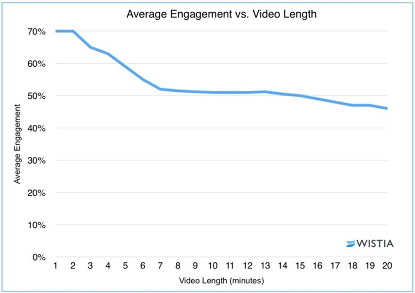
Here’s what we learned:
- People don’t start to lose attention until after the 2-minute mark. So, only if your product or service is complex and absolutely requires a more thorough explaining should you make your video longer than this
- There isn’t much of a drop off in engagement between the 6- and 12-minute marks. So, if you’re worried your video is too long at 6/7 minutes, there’s no need
- After 12 minutes, you are starting to lose your audience again. At this point, you should definitely be asking yourself if the additional information is really worth the additional time and money required to produce it
From experience, I would not recommend making your landing page explainer videos 30-seconds or less. After all, they are supposed to effectively explain a topic, which, in the majority of cases, is virtually impossible in such a short time.
But, while this information is very useful for your landing page explainer videos, it doesn’t necessarily apply to explainer videos that you publish on external platforms such as YouTube and Facebook. This is because their algorithms favour videos that benefit them.
So, if your research has shown that you should target a specific video hosting platform, always familiarise yourself with their best practices before formulating the content. That said, the explainer video format is generally more suited to landing page videos, so here is the one most important thing you need to know:
Watch Time
Understandably, platforms want you to publish video that keep people on their site as long as possible. And, because of this, longer videos tend to be rewarded. Here’s how watch time works:
Say, on average, your YouTube viewers watch 25% of your 8-minute video. This clip you will gain you 2-minutes of watch time.
On the other hand, they watch 75% of your 2-minute video. Here you will have 90 seconds of watch time.
So, as you can see, although the latter is much more engaging, it will be less rewarded than the former by YouTube. To combat this, you should, of course, always make your videos as engaging as possible, but also make them long. I recommend no less than 5 minutes.
The Animated Explainer Video Production Process: The Spiel System
When looking to increase their conversion rates through explainer videos, most companies, when researching agencies, are presented with the same process. Some version of:
- Kick-off Meeting
- The Script
- The Storyboard
- Illustrations
- Voice Over
- Animation
- Music and Sound Effects
- Publish
This method, though it sounds convenient, is unfortunately limited when it comes to delivering real business results.
Here are just some of the things it lacks:
- Measurable objectives that shape the video and allow you to track its performance
- An unbiased understanding of your audience and the messages that would best resonate with them
- A systematic creative approach rather than one based on guesswork (How do you know the creative approach will work? Are you sacrificing real business objectives for aesthetics?)
- A way of testing and measuring the video’s results to inform any improvements
- Findings that can be transferred to other areas of your business
STAGE 1: SET YOUR VIDEO MISSION
It’s impossible to know what sort of video will be right for you if you don’t first define success by outlining what you want it to achieve.
A perfect example would be something like: Grow my sales conversion rate by generating greater brand trust with my audience.
Only then are you ready to move on to the methods that will help you achieve it.
STAGE 2: UNDERSTANDING YOUR PRESENT SITUATION
You don’t yet know why you haven’t got an amazing sales conversion rate already. So, it’s always a mistake at this stage to have preconceived notions of what should be worked on in order to achieve them.
Now it’s time to take a step back and empathise with your customers by viewing your business through their eyes. That way you can define your key performance indicators (KPIs) and return on investments (ROIs) with more certainty.
There are 3 methods for achieving this, all of which should be perused.
1. The Quantitative Perspective (Hard Data)
Heatmap tools such as CrazyEgg and Luck Orange are a great way of determining visitor behaviour to your website.
These are colour reports of how visitors interact with your website. Usually, the warmer the colour the more activity and the cooler the colour the less.
Here is an example of what a heatmap report looks like:
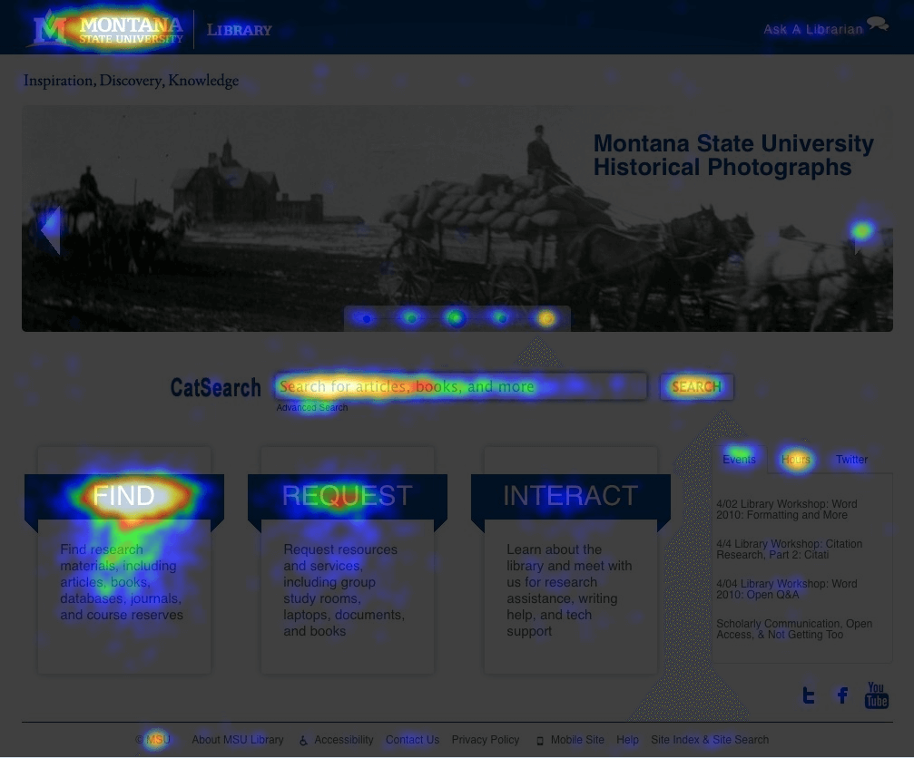
Using heatmaps helps you understand:
- Where visitors are clicking on each webpage
- How far they scroll down each webpage
- Your target audience (by offering insights into the kind of content that does and doesn’t engage them)
- What webpages, and where exactly on them, a new video could be added for greatest impact
2. The Qualitative Perspective (Subjective Data)
When it comes to understanding your customers’ behaviour, not everything can be quantifiable. You must also factor in what impressions your website is making on them, as well your specific customer base’s tastes and feelings towards it.
Gathering this data can be achieved by:
- Using tools like Qualaroo and SurveyMonkey to survey your live website traffic and existing customers
- Studying your online reviews for valuable insights
This research is all about finding your prospects’ key objections in order to negate them with your video content, as well as understanding if you have distinct audiences with different intents and purchasing behaviours.
For example, 2 completely different age brackets are interested in your product or your repeat customers have different needs from your first-time buyers.
Try to define the different audiences and their specific needs as precisely as possible.
3. The Bird’s-Eye View of Your Traffic Sources
It’s impossible to accurately determine your video needs without knowing how people are getting to your website, on which webpage they land, and how they navigate your site.
So, to fully understand your sales funnel, you should map it out in a flow chart. It should begin where your website visitors first encounter your business (a Google Search or on YouTube, for instance) and follow the journey they have to take in order to reach the desired objective (most likely a sale).
To find out how your website visitors are getting there, you can use Google Analytics. This tool allows you to connect all of your social media accounts and video channels and track where your website traffic is coming from and going to.
For example, it could show you that most of your website traffic lands on your service webpage via YouTube. Now you have solid proof that an explainer video would have great effect if placed in one of these locations.
Then, to ensure your flow chart is all-encompassing, combine this data with what you’ve learned from your heatmaps and surveys. It should include every action that a prospect has to take to become your customer. The benefits are fourfold:
1. You can determine with exact accuracy where you should add an video to your sales funnel
2. Based on this location, you will have a good idea of the type of content you should focus on. For example, if most of your visitors are people who need an introduction to your product or if they are already familiar with it but need a breakdown of features to quell their objections
3. You can see clearly if more than 1 video is needed
4. And, finally, it helps you track and measure the impact of the video because you can compare it to your new funnel after the video has been published.
Here is a simple flow chart skeleton without any metrics:
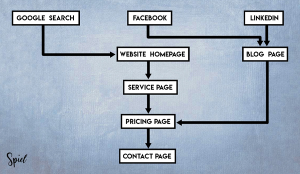
When utilised to its full potential, you can clearly see what’s working, what’s not, and what areas a good explainer would have the greatest impact on your stated mission. Prioritise them for maximum impact.
An easy way to visualise this is to think about all of the roads leading into a city. Just as some roads can carry lots of traffic rather efficiently, there will be roads in your business that are prolific pathways leading to many sales. However, you will inevitably come across other roads that lead to nothing but dead-ends.
STAGE 3: ESTABLISHING KEY PERFORMANCE INDICATORS (KPIs) AND RETURN ON INVESTMENTS (ROIs)
KPIs
Based on the learnings from Stage 2, specific goals and KPIs should now be established. These are the key changes that you must focus on in order to make the greatest impact on your video mission. They could be things like:
- Increase enquiry levels for a specific product on its landing page by 25%
- Reduce bounce rate by 20% on a specific webpage
- Boost signup rates for the ‘free trial’ by 40%
- Increase sales from repeat customers by 10%
The Pareto Principle
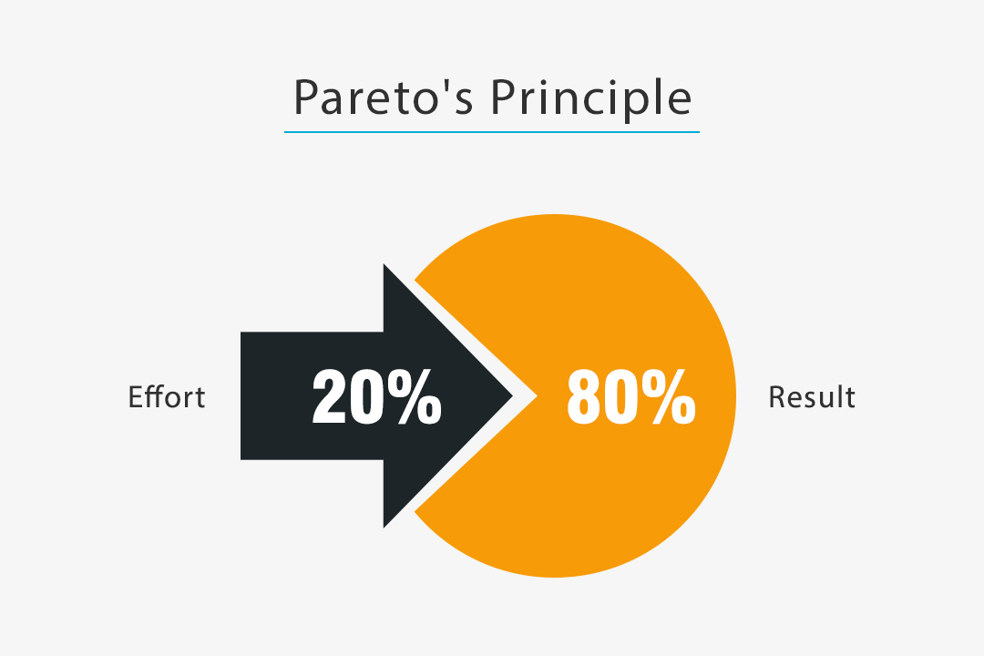
The Pareto Principle states that, for many events, roughly 80% of the effects come from 20% of the causes. Applying this to your KPIs and key messages, you should determine which of them lie in that 20% most effective zone and focus on those in order to achieve 80% of the benefits.
It’s like having 1 basketball player on your team who’s so good that every game they score 80% of the team’s points!
So, with this in mind, what one KPI and one key message does your research suggest would deliver the greatest impact on your explainer video’s mission?
ROIs
The next step is to work out your ROIs wherever possible. A common mistake businesses make is that they neglect to work out the ROI that would result from their KPIs being met. It is important to do this because it helps:
- Determine the impact the project will have on your business if done successfully, helping you prioritise the importance of the work
- Demonstrate the importance of a video to other stakeholders who are likely to be involved in the decision-making process
- Calculate a realistic budget for the project
Every ROI calculation will vary to a certain degree, but, given a simple example, here is how you would calculate it:
Your KPI is to get 10% more conversions from your landing page.
Step 1:
Work out how many new customers you are likely to acquire if the KPI is met. How many more customers would this generate annually?
Step 2:
Calculate the lifetime value of each new customer.
Step 3:
Multiply the number of additional customers you would generate yearly by the lifetime value of the customer to get a ROI estimate.
If you are having difficulty calculating your return on investment, you can get in touch with our video marketing agency Spiel on 0208 798 2507. We’d be happy to help.
STAGE 4: DEVISING THE CONTENT OF YOUR VIDEO
Led by your research, you can start devising the actual content of your video. The main thing to consider here is where it is going to sit in your sales funnel because this will help define what it’s supposed to do.
Sales Funnel
The sales funnel is the journey someone has to take to become your customer (the traffic source map you made in stage 2).
Generally, it is depicted as having 4 steps (like below) and whichever your video lies in, will have a big impact on what its content should be.
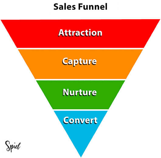
For instance, if your research shows that you should create a video for your YouTube channel that attracts a lot of attention and drives traffic to your website, this will fall in the attraction stage. Meaning the video should be more of an attention-grabbing introduction to your product or service than a detailed breakdown of features.
On the other hand, if you have found that people get all the way to the product page on your site and then leave without purchasing, you will need a video that lies in the capture and nurture stages. This content will be more focussed on explaining your product so that it answers all of the main objections you found in your research.
By combining this knowledge with the breakdown of video styles, and when to use them, at the beginning of this article, you should be able to pinpoint the perfect content for achieving your mission.
STAGE 5: PLANNING YOUR VIDEO PROMOTION
At this stage, some important things to consider for promoting the video are:
- What social media sites and video platforms to publish on and how to optimise for each
- How to design your webpage to encourage as much video plays as possible
Social Media Platforms
Here is a breakdown of the most important guidelines to follow when publishing on 4 of the most popular platforms. Following them will leverage their algorithms in your favour, making your videos as visible as possible. And, if you click on the platform name, if relevant, it will take you to their video ad specs.
If your video could benefit from being published on Facebook, here’s how best to add it to their site:
- Ask questions underneath your video that encourage interaction. The more interaction you can generate, the more it will be rewarded by Facebook.
- Avoid being lazy and simply sharing your video on Facebook from another platform (like YouTube). They are not likely to do well as Facebook wants users to upload Facebook videos. By uploading a video on each platform individually, it is proven that you can get up to 50 times more views.
- As most Facebook videos are watched on mute, make sure you include subtitles to help boost engagement. The more engagement, the more they will reward you.
YouTube
YouTube is best if you’re looking for a large, wide-ranging audience for your explainer. Here’s how best to add it to their platform:
- Here it’s important to keep viewers watching for as long as possible because YouTube actually rewards watch time over view count. So, fascinating, dynamic, humorous, or shocking content is a must.
- Put detailed descriptions under your video with links to your site and, in it, encourage people to comment.
- Check out a little trick called The Sequel Technique here.
If your video is more suited to a corporate, business audience, promoting it on LinkedIn might be best. Here’s how:
- For maximum visibility, post your video between 8 a.m. and 4 p.m. on work days. But always test to see what time works for you – don’t forget to go by the time where most of your audience is, not where you are.
- Just like Facebook, most people will watch your LinkedIn video silent, so always incorporate subtitles.
- And, just like YouTube, detailed video descriptions and contextual titles are rewarded by LinkedIn.
- For more information on the best LinkedIn video promotion techniques, you can also check out our detailed guide here.
Vimeo is all about high-quality videos aimed at a creative, artistic audience. Sound right for your explainer? Here’s what you need to know:
- Tag your video with simple keywords to help people find it. If it’s all about your new music lessons app, for example, tag as many relevant words as possible: ‘music’, ‘guitar’, ‘piano’, ‘chords’, etc.
- Vimeo is all about good design, so customise your Vimeo channel page to compliment your brand. If your theme, colours, and modules are all cohesive, it will reinforce your video’s message and build brand familiarity.
- More than YouTube, you will need to find your audience on Vimeo. To do this, contribute your video to relevant groups or build your own groups around its topic. These are communities and conversations around videos and specific things people like.
Another important factor for getting your video noticed on every platform is having an eye-catching thumbnail. I will discuss how you can do this in more detail at the end of the production stage.
Designing Your Explainer Video Landing Webpage
How you design the landing page that hosts your video has a surprisingly large impact on how many people watch it. So, here are my top guidelines which, if implemented, would encourage as many plays as possible:
- Make the landing page minimal. It should be free from any clutter or distractions that would stop visitors from watching the video. This could include things like large, attention-grabbing images or lots of text.
- Incorporate a catchy page title. It should give the video context.
- Use subtle visual cues. These could be things like a hand pointing towards the video or a person looking at it. By doing this, you subconsciously draw your visitor’s attention towards it.
- Have an eye-grabbing thumbnail image for your video – details coming up.
- Include a single call to action somewhere on the landing page. It should encourage people to do whatever the point of the video is, like ‘click this link for a free trial’, for example.
However, all of these guidelines should be tested after the video has been published. A topic I will get to later in the post.
STAGE 6: PRODUCTION
In this stage you will produce the video and implement it appropriately. It involves seven steps:
Step 1: The Script
How well your message is communicated depends entirely on how good your script is. In fact, the entire success of your explainer video depends on the script! Because it’s so important, many clients tend to want to write it themselves.
We would always suggest leaving it up to a professional scriptwriter outside of your business. They will have a fresh perspective on your company and, because of that, are in a better position to explain it in a way that anyone can follow.
Using the information collected in the previous stages, a good scriptwriter will be able to build a compelling narrative in the tone of your brand. One that your customers can relate to and that answers all of their survey and review concerns.
It should:
- State what you do and get to the point in the nose of the video, i.e. the first 2%
- Speak directly to your audience in a voice and style that they can relate to
- Include the key messages that your research suggested would best achieve the desired KPIs
- If the subject allows, use humour and location changes to hold the viewer’s attention in the long body of the video, i.e. the middle 96%
- Show a problem and prove how your product or service can solve it, rather than stating how
- Exhibit your unique features and benefits
- Let people know where and how they can purchase (call to action)
- Show your worth through companies you’ve previously done business with
- Keep people watching at the tail end of your video, i.e. the final 2%, by using phrases like ‘in summary’ or ‘to wrap things up’ or recapping.
Features vs Benefits
Online, one piece of advice you’re likely to see come up time and again is to focus on the benefits in your script and not the features. But this is not always the case.
The reason this advice is so prevalent is the very same reason why English teachers tell their young students that they can’t start a sentence with ‘and’ or ‘because’. Because it’s just all too easy to only do that. It’s merely a device to prevent people from writing an amateurish or one-sided scripts.
The reality is in most cases, if you only state the benefits of your features and not the features themselves, people just aren’t going to believe you. It will sound like you’re just making empty claims.
For instance, what if if I told you that my product can help you make homemade pasta 10 times faster than you could by hand. You might sarcastically reply, ‘Sure.’ So, here it is necessary for me to mention the features of my product that will allow you to achieve such a feat.
On the other hand, if I mention a feature without the benefits, you might say, ‘Who cares?’ So, to help make you care, I will need to lay out the benefits.
It’s all about finding the perfect balance given each specific situation.
Step 2: Initial Sketches and Storyboard
The art team, with guidance from the art director, will begin visualising the script and drawing multiple sketches for each sentence. The strongest concepts will eventually be chosen and, alongside the script, arranged in the order they will appear on-screen. This is called the storyboard.
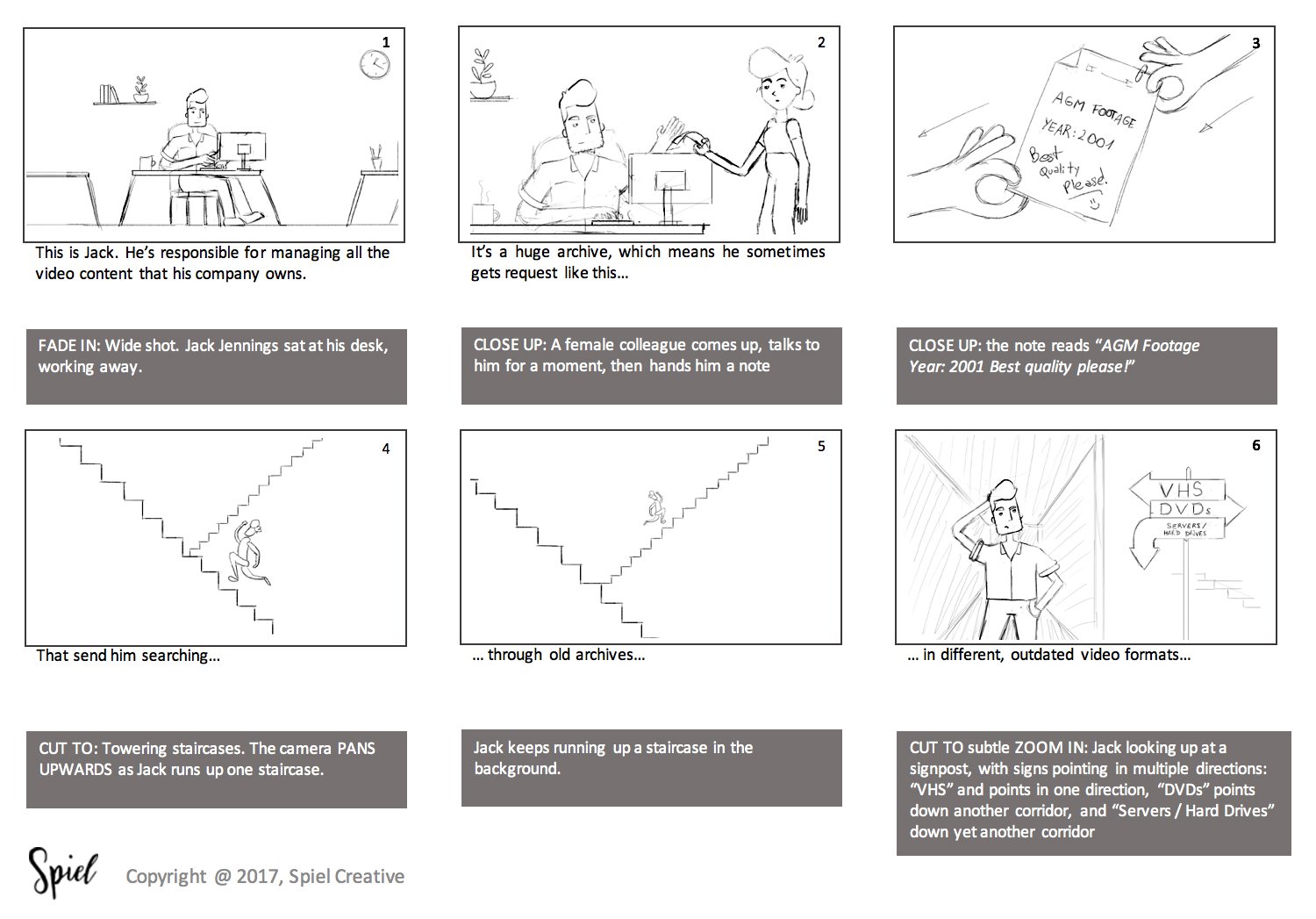
It sounds simple, but creating a quality storyboard requires a lot of different skills and knowledge. Things like storytelling, camera angles, ellipse time and composition all have to be taken into consideration. And, in the end, it will allow you to pre-visualise the video in order to find and deal with problems before the video production process even begins, saving you time and money in the long run.
Make sure to spend time reviewing the storyboard with your team before signing it off.
Step 3: The Voiceover
The voiceover is the voice of an off-screen narrator who reads the script over your video.
When choosing a voiceover artist, make sure to select someone with a voice that will portray the attitude of your brand and resonate with your audience (for example, if you are a children’s toy brand, probably best not to use a deep middle-aged man’s voice – unless you have a very good reason).
Knowing your key demographic is also useful here. If most of your customers are women in their twenties, it’s advisable to use the voice of a woman in her twenties.
Step 4: Illustration
Selecting an Art Style (if you haven’t chosen live-action)
The most important thing to focus on when creating a video is that the message resonates with your audience. Despite what a lot of animation agencies will try and sell you, the artwork should never be overly complex because its main function is to convey your message in as succinct and as easy to understand manner as possible.
An excessive focus on aesthetics can lead to the following undesirable consequences:
- High production values. When it comes time to test your video, you will inevitably have to make changes to it. If these changes are very expensive, it will lead to diminishing returns on conversions, a significant reduction in your return on investment as well as the effectiveness of your KPIs
- The project deadline will be delayed due to the longer production time
- Testing will also start to feel like a pain after putting so much effort into designing a scene to aesthetic perfection. Changing the artwork will become de-motivating experience
- It can be a distraction, diluting the focus of the project. The more you have to focus on artwork and design for extended periods of time, the more it can take away the focus from the key messages and business goals
With that in mind, a graphic designer and illustrator will start bringing the world of the video to life by designing all of its graphic elements in detail and colour. The graphic elements are things like character designs, typography and background settings.
Colour
An effective way to build cohesion between your animated video and your brand is to cleverly place your brand colour within those graphic elements. Remember that an explainer video is a marketing tool like any other, so having your colour present at important moments is a good way of keeping the story linked to your brand in the eyes of the viewer.
Believe it or not, colour can also have a big effect on your conversion rates. Psychologically speaking, certain colours appeal more to certain demographics. So, what’s your business all about? Using warm colours, for example, will give it a more fun and approachable look, while cool colours will deliver an elegant and sophisticated style.
The Characters
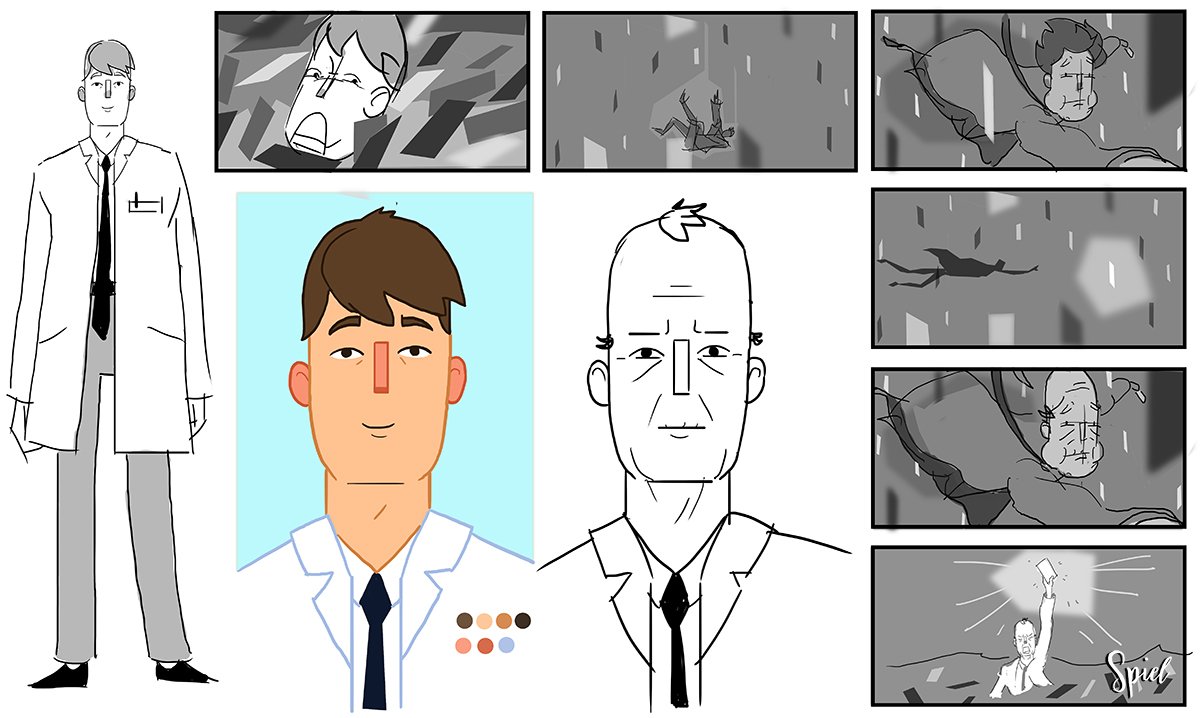
The characters in your video must fully represent your brand persona. Knowing the personality, age range and even physical appearance of your average customer will go a long way to the design of the characters. Are they old or young, black or white, male or female, attracted by cute or rugged things?
A good agency will design a few character options for you to choose from.
Step 5: Animation or Filming
A team of experts working in the field of your chosen animation style will now begin the process of manipulating your graphic elements so that they appear as moving images.
Alternatively, a film crew will film the actors acting out your script.
Step 6: Sound Effects and Music
Sound effects and music are often used to enhance the overall perception of the video. People want to be transported, and these are a simple yet effective way of achieving it.
If your video is set on a beach, for example, have waves lapping, seagulls squawking and children laughing in the background to bring the environment to life.
Step 7: Publish
A brand-new video will arrive in your inbox.
Publish it where your research suggested it would have the greatest impact. If you add it to YouTube, Facebook, Vimeo, etc., make sure it’s appropriately optimised for each platform in order to track its views and relevant data with their built-in analytics tools.
For more information on the growing importance of YouTube for search engine optimisation (SEO), check out this insightful article ‘Look to YouTube for the Future of SEO’ published by UK-based website designer KIJO.
It’s now time to consider your thumbnail image!
Explainer Video Thumbnails
A thumbnail can be a snapshot image from your video or a bespoke image that visitors or browsers see before pressing play. Essentially they act just like a book cover. And yes, people will judge your video based on them.
There have been many thumbnail studies undertaken over the past few years which have come to some definitive conclusions. But that doesn’t mean they will work in every case…
So always test different versions of your thumbnail to see what works for you.
That said, here are the conclusions:
- Use bright but non-offensive colours to help your videos stand out in the right way.
- Include 4 words of text or less that give the video some context. And make sure the font colour contrast against the background to aid readability.
- Incorporate a human face showing some kind of emotion and making eye contact with the camera.
For social media and video hosting platforms, I will refer you back to the The Sequel Technique – here. It’s excellent for helping you stand out amongst the competition.
For more great tips on creating high conversion thumbnails for your explainer videos, watch the video below which we created here at Spiel on this very subject:
STAGE 7: MEASURING RESULTS AND OPTIMISING
Step 1: Measuring and Analysing Data for the KPIs
At this stage, you will start collating all of the relevant data from the tools you used in the marketing strategy to measure results. These include:
- Google Analytics
- CrazyEgg
- Video engagement tools like Wistia
- Social media tools such as Facebook Insights where relevant
Naturally, it will also involve tracking the increase in your enquires and signups, etc.
Once the data has been gathered, you can clearly see if your desired results have been achieved. In light of your new position, it’s good practice to re-draw your visual map to see if there are further opportunities for videos.
Step 2: Experiment to Improve the Video’s Performance
After measuring the results achieved so far, the next step in improving the performance of your video is to experiment and see what works best.
This step is key because you want any potential changes to be backed by proof that they will have a positive impact. This can be done with A/B split and multivariate testing, another service offered by Wistia.
Factors to test include:
- The design of the funnel – should certain steps be removed or added?
- The design of the webpages
- Variations in the video and written content on your webpages
- Different video thumbnails
- The calls to action
You want to continuously review the results and repeat the experiments where necessary until the desired results (KPI’s) have been achieved.
STAGE 8: APPLY FINDINGS ACROSS ALL RELEVANT AREAS OF THE BUSINESS
Finally, make the most of all you’ve learned by implementing the Spiel System across all relevant areas of your business.
Incorporating an Explainer Video into Your Video Marketing Campaign
If you are creating a holistic video marketing campaign, an explainer video is obviously going to make up just one small part of it. A full campaign will consist of many marketing video types covering every stage of your sales cycle. And you can learn all about them here.
A useful way of understanding how it works is the hero hub hygiene framework.
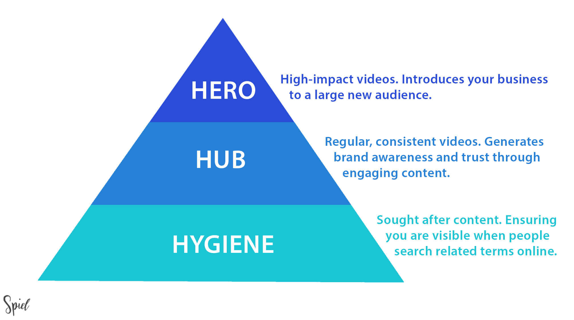
These 3 content types, in short, are:
Hero: Infrequent, high-impact, and emotional brand promotions that aim to introduce your business to a new audience or break into a new segment.
Hub: Regular and consistent videos that give your audience a fresh perspective on their passion points and keeps them engaged.
Hygiene: Videos that ensure your business is present when people search questions and terms relating to your industry online.
Given these definitions, we can see that explainer videos are generally Hub content because they are informative and encourage people closer to a purchase.
But, when creating a video marketing strategy, it’s better to make multiple videos that collectively cover all of the different HHH content types and, as a result, the stages of your sales cycle.
To briefly summarise, I advise that you compliment your explainer videos with:
- Hero content such as big-hit, emotional brand advertisements that grab people’s attention and gets them interested in your brand.
- Further Hub content like demo videos (find out more here), testimonial videos (find out more here) and influencer videos (find out more here).
- Hygiene content like ‘how-to’ videos that answer the internet’s most asked questions in your niche.
How Much Does an Explainer Video Cost?
For production alone, the general industry standard for an explainer video starts at £4,000 and can range into the tens of thousands. It depends on multiple factors such as animation style and quality, video duration, and the calibre of the agency itself.
The Comprehensive Approach
However, for something that is also focused on achieving real business goals, like that outlined in the Spiel System, the price can vary widely depending on your needs, such as:
- Research and strategy
- Marketing plan and implementation
- Testing
- Analysis
As this system is geared towards a high return on investment, it is down to you what you want to put in.
How Can I Find the RIGHT Explainer Video Company?
The first step is to analyse a few agency’s portfolios to see if they are capable of creating the video that you want. If they have years of experience and have worked with some big organisations and brands, that’s always a good sign.
A Comprehensive Approach
Does their process follow the generic steps, i.e. script through to publishing, or do they have an approach geared towards driving measurable results like that outlined in the Spiel System? For the best possible outcome, always choose an agency whose process includes measurable goals, user experience considerations, audience research, testing, and a marketing strategy over those whose doesn’t.
True Collaboration
Agencies who give quotes based on basic features, such as the duration of the animation, are more than likely not approaching your project like a true collaboration.
“Agencies who give quotes based on basic features, such as the duration of the animation, are more than likely not approaching your project like a true collaboration.”
Know the Creatives
You should always talk to the business development team, but don’t neglect the creatives (for example, the creative director). This will help you decide if the agency is right for you because they are the ones who know how to translate your features and benefits into compelling, impactful stories.
Learn About the Team as a Whole
Do they have an all-encompassing skill set?
Are they enthusiastic about your project and responsive to your queries?
Do you feel they understand your message/business needs and are you comfortable with their strategy?
Are they prepared to meet you in their office?
6 Best Tools for Making Explainer Videos
Want to do it yourself? Here are the 5 best video software tools currently on the market:
1. Vyond
Not the cheapest option, but probably the best if you want a final product that is as close to a professional video as possible. Free trial available.
2. VideoScribe
This option is for whiteboard animation specifically. It comes with royalty free images and music and allows you to create whiteboard videos for business without any prior technical understanding. Free trial available.
3. Wideo
Wideo allows you to create professional-looking 2D animated explainer videos easily with built-in templates. The basic package begins at $19 a month.
4. Powtoon
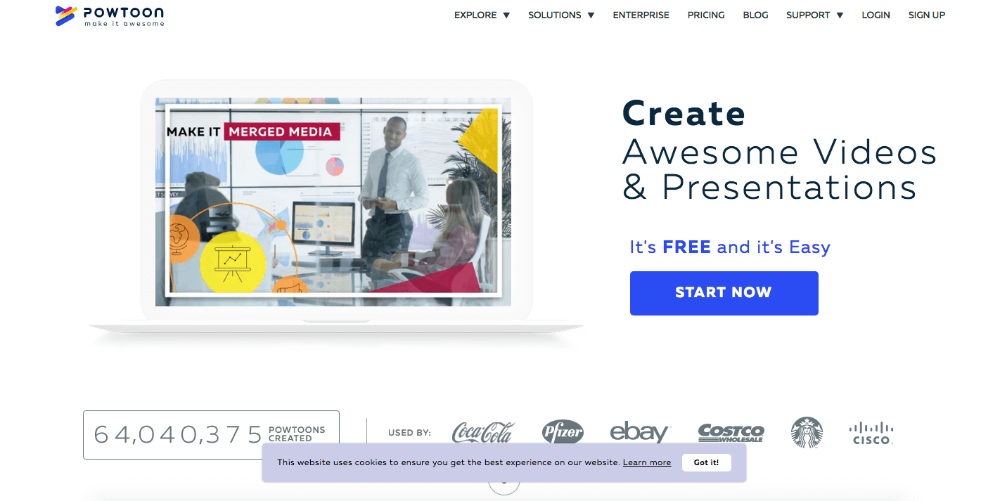
Powtoon is an video software tool that makes it easy to make animated videos with their user-friendly drag and drop tool. Also comes with great templates and a free trial.
5. Animaker
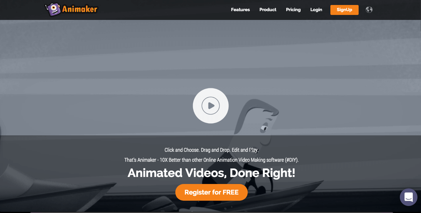
DIY animation software Animaker is perfect for producing creative cartoon explainer videos in a short time and with little to no experience. They also have one of the largest illustration, character, and graphic libraries available.
6. RawShorts
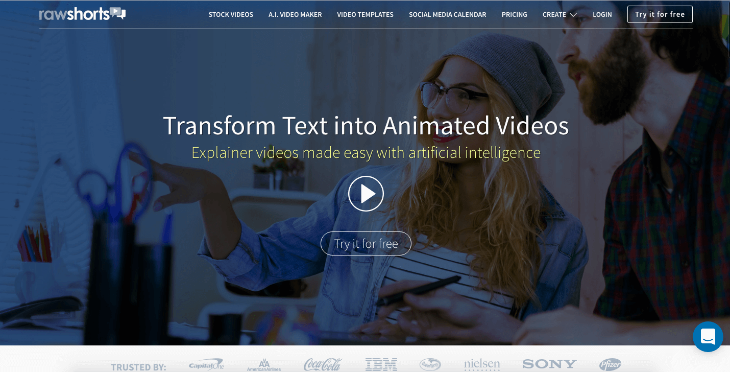
This is also a whiteboard-specific software tool. It is perfect for making creative whiteboard animations with sleek, professional-quality transitions. Also comes with a free trial.
Great Examples of Explainer Videos
Mint.com – Explainer Video
Personal financial management service, Mint.com, effortlessly packs a lot of information into this 90-second video. The continuous side-scrolling animation flows smoothly through their features giving the viewer a sense that the app is intuitive and convenient.
Key Learning Points
If you have a lot of information to get across in under 2 minutes, what animated techniques could you employ to make it seem effortless rather than overwhelming?
Munzit – Explainer Video
In this 70-second explainer, Munzit combines motion graphic techniques with engaging and cute character animations to appeal to a target audience of young social media users.
Key Learning Points
What characters could you think up to embody your brand?
Airbnb – Explainer Video
This is a perfect example of a simple live-action explainer. It was made by online marketplace and hospitality service Airbnb to explain exactly how people can use their service.
Key Learning Points
If live-action is necessary for your explainer videos, keeping them simple is a good way to keep down the costs.
Verto Group Developments – Explainer Video
This is a great explainer from the team here at Spiel. It is for the Verto Homes, a sustainable, forward-thinking housebuilder.
The 100-second clip combines an ambitious message, a script that ticks all boxes, good use of music and compelling animation to deliver a model animated explainer.
Key Learning Points
When you follow the proven best practices, you are more likely to end up with a successful end product.
Works with Nest – Explainer Video
In this 2-minute explainer, smart home devices company Nest took a unique approach and combined stunning 2D animation with real-life images of their products.
Key Learning Points
Could a combination of video styles best serve your message?
RocheMartin – Explainer Video
In this 105-second video for emotional intelligence software company RocheMartin, our animation team here at Spiel did a great job at taking a complicated topic and filtering it down to an easily digestible narrative animation.
Key Learning Points
If your message is complex, consider a light-hearted animation style to make it more accessible to a wider audience.
Google Pixel 2 – Explainer Video
In this 2-minute video, titled ‘Ask More of Your Phone’, Google explains how their phone can answer pretty much any question you ask it from their customers’ perspective. What it lacks for in a strong narrative, it makes up for in amusing scenarios and variety of characters.
Key Learning Points
If your product is suited to a universal audience, prove it in your video.
Twitter Flight School – Explainer Video
Twitter created this sleek and colourful animated explainer for their free online education program for advertisers, Flight School. It is a great example of how you can sell a product without being overly salesy or forceful.
Key Learning Points
Combing a script that conveys your key messages effortlessly with simple, flowing animation is a perfect recipe for a great explainer.
Duolingo – Explainer Video
Free language-learning platform Duolingo created this simple explainer video as an introduction to using their app. It very effectively explains the complexities of their teaching methods with basic visual analogies.
Key Learning Points
If your product is supported by complex data or science, rather than overcomplicating the script, let the visuals show why and how it works in your video.
Whistle – Explainer Video
Pet tracker company Whistle created this live-action video to show how their on-collar monitor measures your dog’s activities. Using their app, you can get amazing insights into your dogs’ needs and improve their lives.
Key Learning Points
Sometimes you don’t need a script to effectively explain what it is you do. Perhaps your product can be better explained by showing how it works in real-life scenarios?
TripCase – Explainer Video
Travel App TripCase recreated the opening scene of Jackie Brown in this excellent explainer. Having a brilliant on-screen narrator explaining the app while moving along an airport escalator not only offers context, but also gives the viewer a sense that it is easy to use on the go.
Key Learning Points
Are there any iconic movie scenes that are relevant to your business? A clever recreation of them can be a great way to boost your audience.
Dollar Shave Club – Explainer Video
This now iconic video features Mike, the founder of American personal grooming product company Dollar Shave Club. With a title like ‘Our Blades Are F***ing Great’, it’s instantly attention-grabbing, and Mike’s comedic delivery doesn’t disappoint.
Key Learning Points
Don’t be afraid to break the rules. Being shocking or humorous, when done correctly, is great for brand awareness.
Headspace – Explainer Video
Guided meditation app Headspace decided endearing animation was the best way to explain how meditation works with their product. This simple 2D clip effectively shows the viewer that taking up meditation doesn’t have to be an ordeal.
Key Learning Points
If your product or service could be considered too difficult or complex, try using endearing animation and a simple script to change people’s perspectives.
Chordify – Explainer Video
Music app Chordify helps musicians of all levels to learn and play any song by turning it into chords. Fittingly, they have chosen to explain the app’s features through on-screen text and demonstrations, replacing the narrator with an uplifting track.
Key Learning Points
Adapting your video to your brand ethos helps to build your brand identity.
BoomTown – Explainer Video
Real estate software platform BoomTown created this video to show industry professionals how they can generate leads, manage contacts, and run their business better. It is a good example of how you can effectively fuse live-action with motion graphics to create something dynamic.
Key Learning Points
Blending 2 styles can simultaneously help you explain your product or service and make your video unique.
Baker Hughes – Explainer Video
This is a great example of a whiteboard video produced by the team here at Spiel. It’s for leading oil and gas field services company Baker Hughes and breaks from the traditional white background format.
Key Learning Points
What creative alternatives to black on white could you think up to make your whiteboard video stand out?
DFINITY – Explainer Video
Blockchain-based cloud computing project DFININTY created this video to do the difficult task of explaining how they plan to build an ‘open, decentralised blockchain that runs smart contract software systems with vastly improved performance, capacity, and algorithmic governance.’
Key Learning Points
With some clever visual representations, you can explain even the most complex subjects.
TrustATrader – Explainer Video
TrustATrader.com has a simple business model: they help you find the most trusted traders and tradespeople in your area. Hence why they can create an effective explainer that is just 30 seconds long.
Key Learning Points
Although an explainer will rarely go under the 30-second mark, if your business model is simple, you can comfortably tell your story with a good script in that time.
Atlas – Explainer Video
Computer software company Atlas Informatics made this live-action clip to explain how their Atlas Recall software can save you time by instantly retaining and arranging all of the info you read on each of your devices, apps, and services.
Key Learning Points
Especially when it comes to complicated tech companies, live-action videos can help humanise the brand and help make their product feel welcoming.
Travi – Explainer Video
Travi is an app that offers tailor-made travel experiences. In this 2D explainer, they tell us why we should avoid mass tourism (not that we needed it) and download their app to find a local host.
Key Learning Points
When depicting a variety of stunning locations on a small budget, colourful 2D animation is the best way to achieve it.
McKesson Health Mart – Explainer Video
Online business management tool for independent pharmacies, Health Mart Pharmacy, chose whiteboard animation as the best way to engage an audience with their offer. It visualises how pharmacies can sign up and everything they potentially gain from doing so.
Key Learning Points
Whiteboard animation offers great engagement for a low price.
microMole – Explainer Video
Sewage system sensor company microMole created this Sims-like 3D explainer. It is a highly effective way of showing the viewer how their product works in real-world urban environments.
Key Learning Points
If you sell a very specific and highly specialised product or service, think about how you can visually show it working rather than confusing or boring people with explanation.
Seagate BarraCuda – Explainer Video
American data storage company Seagate created this animated split-screen video to show how their BarraCuda Pro hard drive can help boost creative productivity.
Key Learning Points
Using a split-screen to tell 2 sides of your story is very effective for encouraging the viewer to take action. Seeing the cost of inaction really drives home what they gain to lose without your product or service in their lives.
BitTube – Explainer Video
Brand new video sharing platform BitTube made this 2-minute narrative-based explainer. And, yes, I only found it because it’s posted on their biggest rival’s platform!
Key Learning Points
When faced with strong competition, focussing on the major benefits that sets your business apart is the way to go.
Ubiety – Explainer Video
Video web and audio conferencing company Ubiety created this video to show how their solution removes all of those irritating video conference-call problems like blurred images and software updates.
Key Learning Points
If your business has a wide-ranging user base, show it with a cast of diverse animated characters.
Apollo Currency – Explainer Video
The world’s fastest, most private’ all-in-one cryptocurrency Apollo Currency created this explainer to help viewers unravel the complex world of electronic cash. Although it is visually quite simple, the script effectively explains cryptocurrency in such a way that even people relatively new to the concept can understand.
Key Learning Points
Comparing your business’ key benefits to competitors can be a bold way of setting you apart – if done correctly.
Metalogix
This video was created for Metalogix, one of the world’s leading providers of enterprise data migration and data management solutions. This is a good example of how motion graphics and bring a unique, fluid quality to your animation.
Key Learning Points
If your script could benefit from continuous, flowing animation, motion graphics is likely to be the style for you.
Art Gallery of New South Wales
This video mimics the minimalist style of an art gallery to help portray the brand’s identity – in this case, the Art Gallery of New South Wales. Here the viewer learns all about the interactive features on their website for those who registered.
Key Learning Points
If your research found that you would benefit from more website signups, give people an incentive and promote it with a quality explainer.
Conclusion
- I hope this post has helped get the ball rolling on your own explainer.
- When sourcing a video agency, always recognise the difference between those that offer a bare minimum service compared with those offering a truly comprehensive collaboration such as that outlined the Spiel System.
- Have a question about explainer videos or care to leave some feedback? Please do so in the comment section below and I will do my best to respond!
If you would like to discuss your explainer video further, you can get in touch with our explainer video company Spiel by calling 0208 798 2507.


Hello, there has been an increase in animated infographic in recent years. Some place more emphasis on aesthetics rather than disclosing information. Can you share a blog post about bad infographic?
Thanks for the idea Melis. Really appreciate it. I will try write a post on this at some point.
Thanks for the examples the explainer video is a little expensive but still they are effective
nice blog
Great post, Darren! Thank you for going a step forward a sharing the best tools for making explainer videos. However, I do feel that for best results businesses should hire an expert. Thanks for this in-depth guide. Keep up the good work!
Such a nice guide and collection of Best explainer videos. Helpful to learn and gain new ideas.
Hey Darren, A Long and Nice post. With the market becoming more and more competitive it is not sufficient to grab attention. Explainer videos are helpful in marketing strategies.
Thanks Trevor
These videos are really helpful and at the same time quite educational.
Thanks Hardik. Much appreciated
Loved the compilation. Thank you for sharing such a detailed piece.
Thank you.
A very detailed blog regarding the types of explainer videos. This will help other business owners to also determine how to make explainer video about their business and how important it is.
Thanks Steave
Hi Darren, A Nice and Informative Post. Digital marketing has reached brand new heights in today’s day and age. An explainer video is a short video that you can display on the landing page of your website that gives a quick overview of your business and what it does engagingly.
Thanks Stellar
Superb guide with lots of information. Thanks for sharing.
Thanks Rekha
Explainer videos engage visitors by narrating their brand stories in terms of short animated videos. Compelling videos deserves more attention and it can be developed based on various strategies and methods as listed above. Really nice piece of share. Thank you for the listing.
Thanks Emma. Appreciate you found the post useful. Agree that explainer videos are great for narrating brand stories!
Explainer videos have the key to evoke emotion. Nice and knowledgeable. Thanks for sharing
Thanks Johnson. Glad you enjoyed the post.
Hey Darren, A Long and Nice post. With the market becoming more and more competitive it is not sufficient to grab attention. Explainer videos have the power to evoke emotion and most purchase decisions are made based on emotions. Video Production is such a good idea for marketing and convert visit to your consumer.
Good job, a very captivating article and thanks for sharing.
Thank you.